
الخرائط هي أدوات سياسية قوية تشكل ماضي وأمر ومستقبل الأمة – وتسمح الخرائط المضادة للأفراد العاديين باستعادة السردية.
Maps are powerful political tools shaping a nation’s past, present and future – counter maps allow everyday people to reclaim the narrative
From who gets to vote to how people travel and where taxpayer dollars are funneled, politicians and urban planners wield maps to control public imagination.
بدءاً من من يحق له التصويت وصولاً إلى كيفية تنقل الناس وأين تُصرف أموال دافعي الضرائب، يستخدم السياسيون ومخططو المدن الخرائط للتحكم في الخيال العام.
Throughout time, maps have been useful tools for those in power to stake their claim over territories and markets. Politicians start nationwide redistricting battles to ensure partisan control, weakening the power of voters. The Trump administration’s geopolitical posturing over Greenland builds on a long history of imperialism aided by maps. And in ancient Rome, the Peutinger map depicted vast ideas of empire by placing Rome at the center of the world.
على مر الزمن، كانت الخرائط أدوات مفيدة لأصحاب السلطة لتأكيد مطالباتهم على الأقاليم والأسواق. يبدأ السياسيون معارك إعادة تقسيم الدوائر على مستوى الدولة لضمان السيطرة الحزبية، مما يضعف قوة الناخبين. ويُبنى الموقف الجيوسياسي لإدارة ترامب تجاه غرينلاند على تاريخ طويل من الإمبريالية التي ساعدت فيها الخرائط. وفي روما القديمة، صورت خريطة بيوتينغر أفكاراً شاسعة عن الإمبراطورية بوضع روما في مركز العالم.
But maps can also tell hidden stories about politics and power that help people reclaim access to their own spaces and futures. These include counter maps – that is, maps that rework existing assumptions – to expand on the dominant narratives about a place to include viewpoints that were previously excluded.
لكن الخرائط يمكنها أيضاً أن تروي قصصاً خفية عن السياسة والسلطة تساعد الناس على استعادة الوصول إلى مساحاتهم ومستقبلهم الخاصة. وتشمل هذه الخرائط المضادة – أي الخرائط التي تعيد صياغة الافتراضات القائمة – لتوسيع السرديات المهيمنة حول مكان ما لتشمل وجهات نظر كانت مستبعدة سابقاً.
As an urban and architectural designer, mapper and spatial politics researcher, I’ve seen how maps shape urban spaces and the stories told about them. I’ve also seen how maps have the power to question these stories, opening up other meanings a place can have that are shared by everyday residents and workers.
بصفتي مصمماً حضرياً ومعمارياً، وباحثاً في السياسات المكانية، رأيت كيف تشكل الخرائط الفضاءات الحضرية والقصص التي تُروى عنها. ورأيت أيضاً كيف أن للخرائط قوة التشكيك في هذه القصص، فاتحةً بذلك معاني أخرى يمكن أن يحملها المكان، وهي المعاني التي يتقاسمها السكان والعمال اليوميون.
More than just digital wayfinding aids, maps are strategic tools of world-building. Maps show how certain ideas and boundaries that people may think are fixed can be rendered flexible. Anyone can make a map, and because maps are instruments of spatial storytelling, the possibilities they reveal about places are actually endless.
الخرائط هي أكثر من مجرد مساعدات رقمية لتحديد الاتجاهات؛ إنها أدوات استراتيجية لبناء العالم. تُظهر الخرائط كيف يمكن جعل بعض الأفكار والحدود التي قد يعتقد الناس أنها ثابتة مرنة. يمكن لأي شخص أن يصنع خريطة، وبما أن الخرائط هي أدوات للسرد القصصي المكاني، فإن الاحتمالات التي تكشفها حول الأماكن هي في الواقع لا نهائية.
Who makes the maps?
من يصنع الخرائط؟
Geographer Mark Monmonier famously described how to lie with maps. He pointed out that mapmakers who have power, like governments and companies, use selective editing to advance specific goals or disseminate a brand.
وصف الجغرافي مارك مونمونيير الخدعة التي يمكن أن تُمارس بالخرائط. وأشار إلى أن صانعي الخرائط الذين يمتلكون السلطة، مثل الحكومات والشركات، يستخدمون التحرير الانتقائي لدفع أجندات محددة أو نشر علامة تجارية معينة.
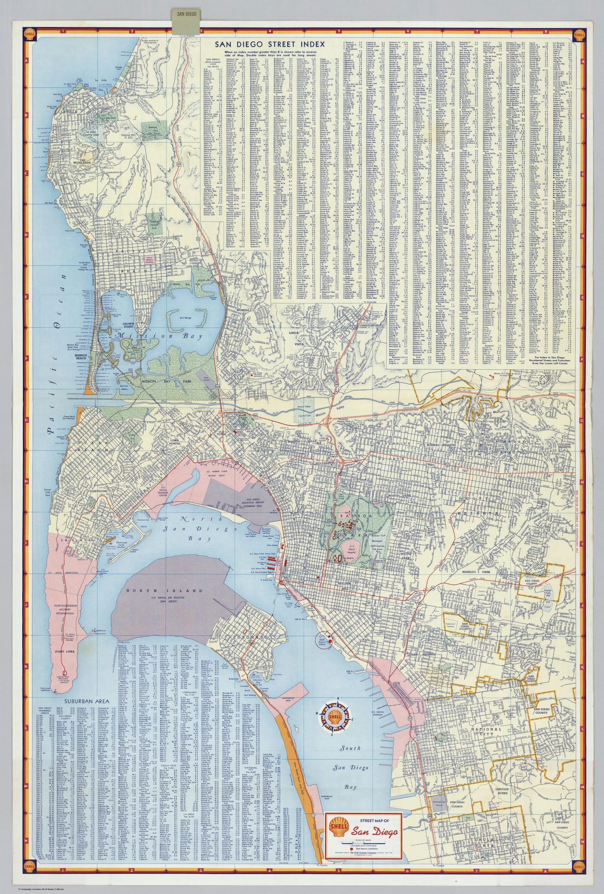
The Shell Oil road maps of the 1950s are a useful example of maps as marketing. With a large logo on the front and the Shell north star compass on the inside, these maps were provided free in gas stations across the country. They advertised the brand while facilitating auto travel by delineating roads and major features, including mileage charts on the backs so motorists could plan gas stops. The maps omitted competing transit systems like bus routes.
تُعد خرائط الطرق لشركة شل للنفط في الخمسينيات مثالاً مفيداً للخرائط كأداة تسويق. فمع وجود شعار كبير على الواجهة وبوصلة شل الشمالية في الداخل، تم توفير هذه الخرائط مجاناً في محطات الوقود في جميع أنحاء البلاد. لقد أعلنت عن العلامة التجارية أثناء تسهيل السفر بالسيارة من خلال تحديد الطرق والمعالم الرئيسية، بما في ذلك جداول المسافات على الظهر حتى يتمكن السائقون من التخطيط لتوقفات الوقود. وقد أغفلت الخرائط أنظمة النقل المنافسة مثل مسارات الحافلات.
Public agencies and public-private partnerships also advance agendas via maps. The Home Ownership Loan Corporation redlined maps of the 1930s show even more directly how the government and real estate industry used maps to exclude certain communities. These maps were made for almost every major American city, and the zones they marked as risky for lenders coincided with neighborhoods where African Americans lived, thus taking them out of the home ownership market.
تُحرز الوكالات العامة والشراكات بين القطاعين العام والخاص أيضاً أجندات عبر الخرائط. تُظهر الخرائط المحددة باللون الأحمر (redlined maps) التي أصدرتها مؤسسة قروض ملكية المنازل في ثلاثينيات القرن الماضي بشكل أكثر وضوحاً كيف استخدمت الحكومة وصناعة العقارات الخرائط لاستبعاد مجتمعات معينة. وقد أُنشئت هذه الخرائط لكل مدينة أمريكية رئيسية تقريباً، وتزامنت المناطق التي وُصفت بأنها محفوفة بالمخاطر للمقرضين مع الأحياء التي عاش فيها الأمريكيون من أصل أفريقي، وبالتالي إخراجهم من سوق ملكية المنازل.
One can look today to gerrymandering efforts in states like Texas and Florida to see how maps are used to control who has access to the levers of democracy. These redistricting cases were done outside of a typical census year in order to win more congressional seats in the 2026 elections.
يمكن للمرء أن ينظر اليوم إلى جهود التلاعب بالدوائر الانتخابية (gerrymandering) في ولايات مثل تكساس وفلوريدا ليرى كيف تُستخدم الخرائط للتحكم في من لديه حق الوصول إلى آليات الديمقراطية. وقد أُجريت حالات إعادة تقسيم الدوائر هذه خارج سنة التعداد السكاني المعتادة بهدف الفوز بالمزيد من المقاعد في الكونغرس في انتخابات عام 2026.
Remapping the ‘behind the scenes’
إعادة رسم الخرائط لـ “ما وراء الكواليس”
If maps are used to systematically shut minority neighborhoods out of property markets, then remapping these systems can reveal how the strings of government and private industry are pulled to exclude these neighborhoods, and whom this exclusion benefits.
إذا كانت الخرائط تُستخدم لحرمان الأحياء الأقلية بشكل منهجي من أسواق العقارات، فإن إعادة رسم هذه الأنظمة يمكن أن تكشف كيف تُسحب خيوط الحكومة والصناعة الخاصة لاستبعاد هذه الأحياء، ولمن يفيد هذا الاستبعاد.
In my book “Radical Atlas of Ferguson, USA,” I remap this American city to show what happens behind the scenes in regional and municipal planning, revealing why such stark conditions of inequality persist there.
في كتابي “الأطلس الراديكالي لفيرغسون، الولايات المتحدة الأمريكية،” أعيد رسم خريطة هذه المدينة الأمريكية لأُظهر ما يحدث وراء الكواليس في التخطيط الإقليمي والبلدي، كاشفاً بذلك سبب استمرار مثل هذه الظروف القاسية من عدم المساواة هناك.
The suburb of Ferguson, in North St. Louis County, Missouri, made it into the national spotlight in 2014 after a white police officer shot and killed Michael Brown Jr., an unarmed Black teenager. The community response to this injustice helped to spur the Black Lives Matter movement.
أصبح ضاحية فيرغسون، في مقاطعة شمال سانت لويس، ميسوري، محط الأنظار الوطنية في عام 2014 بعد أن أطلق ضابط شرطة أبيض النار وقتل مايكل براون الابن، وهو مراهق أسود غير مسلح. وساعد رد فعل المجتمع على هذا الظلم في تحفيز حركة “الحياة السوداء مهمة.”
With the maps in this book, I layered in new stories to unpack the strained political and economic context underlying Ferguson. For example, historian Walter Johnson points out that there are several major Fortune 500 companies located just blocks from where Brown was killed. While those companies receive heavy tax subsidies and public development incentives for their physical growth, the rest of the municipality’s spending for necessities like public schools and sidewalks remains underfunded. By highlighting these facets of the landscape, maps can show who actually controls the imaginations of urban planners and politicians.
باستخدام الخرائط في هذا الكتاب، أضفت قصصاً جديدة لتفكيك السياق السياسي والاقتصادي المتوتر الذي يكمن وراء فيرغسون. على سبيل المثال، يشير المؤرخ والتر جونسون إلى وجود العديد من شركات Fortune 500 الكبرى الواقعة على بعد بنايات قليلة من مكان مقتل براون. وفي حين تتلقى هذه الشركات إعانات ضريبية كبيرة وحوافز تنمية عامة لنموها المادي، يظل إنفاق بقية البلدية على الضروريات مثل المدارس العامة والأرصفة غير ممول بشكل كافٍ. ومن خلال تسليط الضوء على هذه الجوانب من المشهد، يمكن للخرائط أن تُظهر من يسيطر فعلياً على خيال المخططين الحضريين والسياسيين.
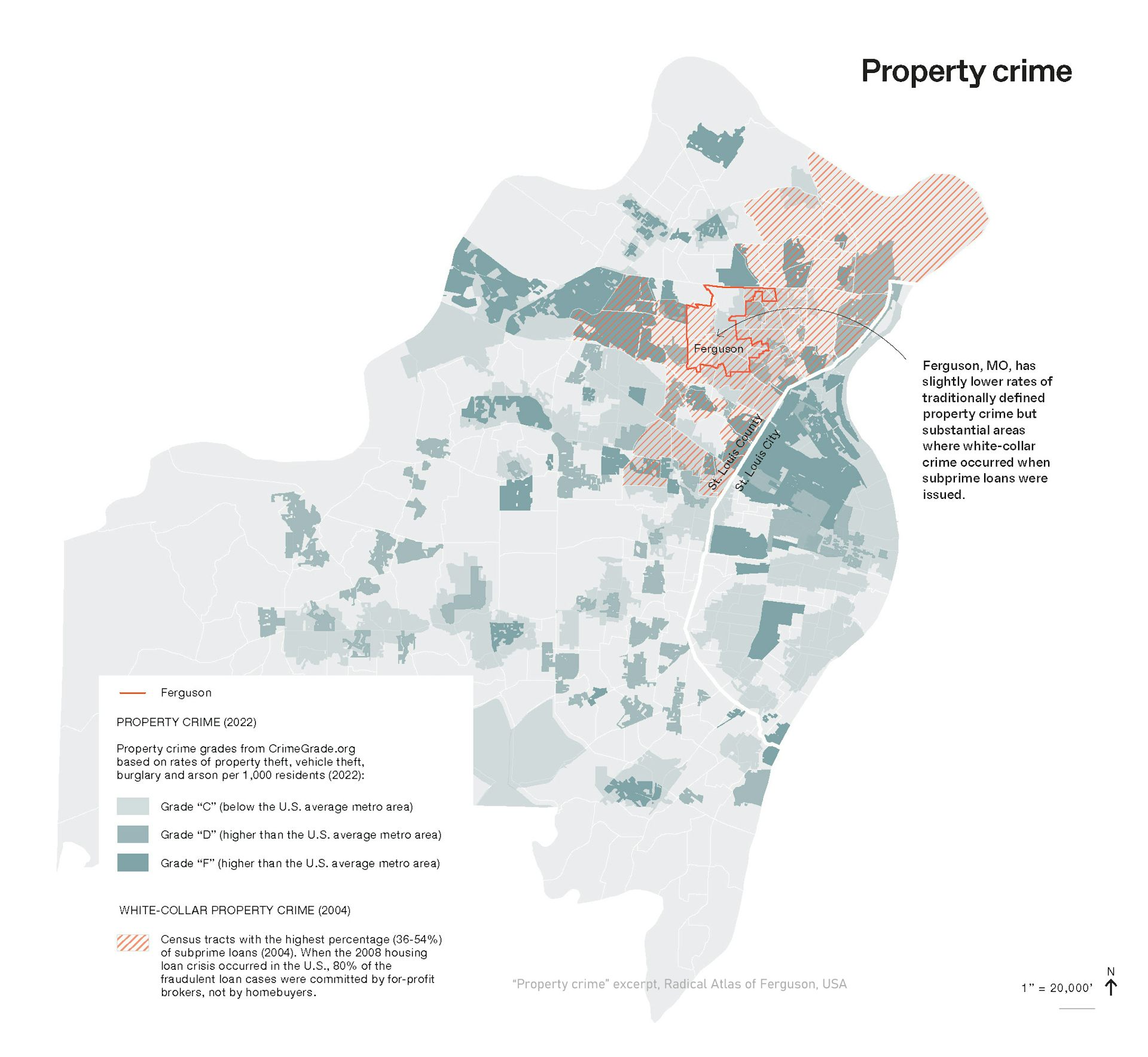
Remapping helps policymakers become more aware of biases within the data they use for mainstream neighborhood assessments and municipal map-making. Maps showing seemingly objective crime data, for example, often reinforce ideas of risk in minority neighborhoods. But when property crime in North St. Louis County, where a majority of Black residents live, is overlaid with the white-collar mortgage fraud crimes of 2008 – a dataset not readily available in typical municipal catalogs – it becomes evident how this area was targeted by subprime mortgage lenders. Broadening how people evaluate data and its sources can shift attention to the underlying forces shaping the statistics.
تساعد إعادة رسم الخرائط صانعي السياسات على أن يصبحوا أكثر وعياً بالتحيزات الموجودة في البيانات التي يستخدمونها لتقييم الأحياء الرئيسية ورسم الخرائط البلدية. فالخرائط التي تُظهر بيانات جريمة تبدو موضوعية، على سبيل المثال، غالباً ما تعزز أفكار الخطر في الأحياء الأقلية. ولكن عندما يتم تراكب الجرائم العقارية في مقاطعة شمال سانت لويس، حيث يعيش غالبية السكان السود، مع جرائم الاحتيال العقاري ذات الياقات البيضاء لعام 2008 – وهي مجموعة بيانات غير متاحة بسهولة في الكتالوجات البلدية النموذجية – يصبح من الواضح كيف استُهدف هذا المنطقة من قبل مُقرضي الرهن العقاري عالي المخاطر. وتوسيع كيفية تقييم الناس للبيانات ومصادرها يمكن أن يحول الانتباه إلى القوى الكامنة التي تشكل الإحصائيات.
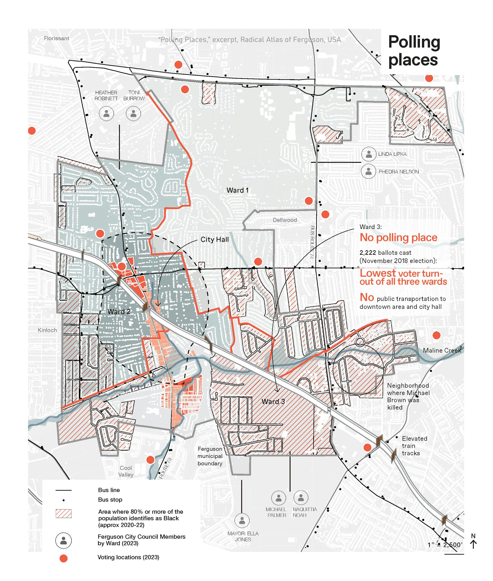
Remapping can also combine layers of seemingly unrelated information to discover new links between spatial details. For example, why is voter turnout so low in the ward where Brown was killed? A map of racial demographics combined with polling locations reveals there is not only no polling place in the majority African American ward, but also physical barriers – including an elevated rail line and stream corridor – that prevent residents from easily accessing City Hall and other polling places.
يمكن أيضاً لإعادة رسم الخرائط أن تجمع بين طبقات من المعلومات التي تبدو غير ذات صلة لاكتشاف روابط جديدة بين التفاصيل المكانية. على سبيل المثال، لماذا معدل إقبال الناخبين منخفض جداً في الدائرة التي قُتل فيها براون؟ تكشف خريطة التركيبة السكانية العرقية المدمجة مع مواقع التصويت أنه لا يوجد فقط مركز تصويت في الدائرة التي يغلب عليها الأمريكيون الأفارقة، بل توجد أيضاً حواجز مادية – بما في ذلك خط سكة حديد مرتفع وممر مجاري – تمنع السكان من الوصول بسهولة إلى قاعة المدينة ومراكز التصويت الأخرى.
Maps for the people
خرائط للشعب
As those in power continue to politicize maps, the practice of remapping can serve the broader public by making those systems of power more visible to everyone.
مع استمرار أصحاب السلطة في تسييس الخرائط، يمكن لممارسة إعادة رسم الخرائط أن تخدم الجمهور الأوسع من خلال جعل أنظمة القوة هذه أكثر وضوحًا للجميع.
Counter maps have inspired activists to edit previously omitted information back into mainstream accounts. Mapmaker Andrew Middleton introduced me to one example: a petrofuturist view of the Shell Oil maps. These counter maps show the roads documented in the Shell Oil maps underwater based on projected sea level rise due to climate change – which is caused predominantly by the burning of fossil fuels produced by companies including Shell.
ألهمت الخرائط المضادة النشطاء لتضمين المعلومات التي تم حذفها سابقًا مرة أخرى في السجلات الرئيسية. عرّفني صانع الخرائط أندرو ميدلتون على مثال: منظور مستقبلي للنفط لخرائط شركة شل للنفط. تُظهر هذه الخرائط المضادة الطرق الموثقة في خرائط شل للنفط تحت الماء بناءً على الارتفاع المتوقع لمستوى سطح البحر بسبب تغير المناخ – والذي يسببه بشكل أساسي حرق الوقود الأحفوري الذي تنتجه شركات بما في ذلك شل.
Maps are scaled geographical projections, ensuring legibility and usefulness. They are understood by people of all ages. They communicate graphically across languages, and they’re portable. When maps and counter maps uncover and layer the otherwise unseen relationships that shape a place, they assert new forms of collective memory, offering more meaningful versions of public authority.
الخرائط هي إسقاطات جغرافية بمقياس، تضمن سهولة القراءة والفائدة. يفهمها الناس من جميع الأعمار. تتواصل بيانيًا عبر اللغات، وهي قابلة للحمل. عندما تكشف الخرائط والخرائط المضادة وتطابق العلاقات غير المرئية التي تشكل مكانًا ما، فإنها تؤكد أشكالًا جديدة من الذاكرة الجماعية، وتقدم إصدارات أكثر معنى للسلطة العامة.
Patty Heyda does not work for, consult, own shares in or receive funding from any company or organization that would benefit from this article, and has disclosed no relevant affiliations beyond their academic appointment.
لا تعمل باتي هايدا لصالح، ولا تستشير، ولا تملك حصصًا في، ولا تتلقى تمويلاً من أي شركة أو منظمة قد تستفيد من هذه المقالة، ولم تفصح عن أي انتماءات ذات صلة تتجاوز منصبها الأكاديمي.
Read more
-

يطعم الأرز مليارات البشر – لكن دوره في تغذية تغير المناخ يتزايد
Rice feeds billions of people – but its role in fueling climate change is growing
